

Redesigning an Amazon Legacy: From Bakery On Main to Uncle Crumbles
When Bakery On Main decided to transform into Uncle Crumbles, the challenge was clear: retain the heart of their brand while reaching a new audience in the competitive world of CPG. This wasn’t just a name change; it was a full evolution that demanded a cohesive digital strategy, one that would speak directly to the modern, health-conscious shopper.
I dove into the data, uncovering insights about our loyal customers and the potential audience we wanted to reach. Using detailed customer personas, I identified what resonated most with them: wholesome ingredients, convenience, and a playful, approachable tone. These insights became the backbone of the Amazon A+ content I created.
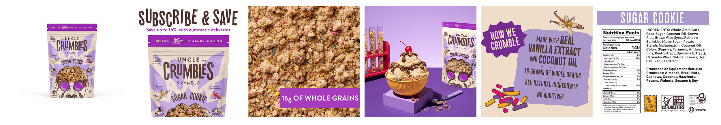
For individual products, I designed A+ Content that blended vibrant imagery with benefit-driven storytelling. Each product’s story was tailored to highlight its unique features—whether it was the crunch of the granola clusters or the comfort of gluten-free snacking. I also built Uncle Crumbles' Amazon Storefront, creating a seamless and inviting shopping experience that felt like a warm welcome to a trusted family kitchen.
To maximize visibility, I worked on Amazon Ads, pairing compelling copy with targeted keywords to drive engagement and conversions. The results? Increased product visibility, higher click-through rates, and improved brand recognition across the Amazon platform.
Rebranding is more than a visual overhaul—it’s about connecting with people on an emotional level. By combining data-driven insights with creative execution, I helped Uncle Crumbles turn a fresh start into a success story.
Analyzing the Old to Build the New
When I first reviewed Uncle Crumbles' Amazon storefront, it was clear there was untapped potential. The storefront's opening section struggled to grab attention—it was overly text-heavy and lacked visual appeal. It failed to tell the story of the brand or connect with their ideal customer.
Shoppers were immediately greeted with a flood of product listings, leaving them overwhelmed rather than inspired. There was no sense of hierarchy, no engaging content to guide customers, and no clear message about what made Bakery On Main/ Uncle Crumbles unique. It was an experience that neither welcomed visitors nor converted them into buyers.
To turn things around, I started by putting myself in the shoes of the ideal customer. Using customer personas, I asked: What would they want to see? What would excite them? I realized we needed to answer three key questions upfront:
Who is Uncle Crumbles?
What makes their products special?
Why should someone choose Uncle Crumbles over competitors?
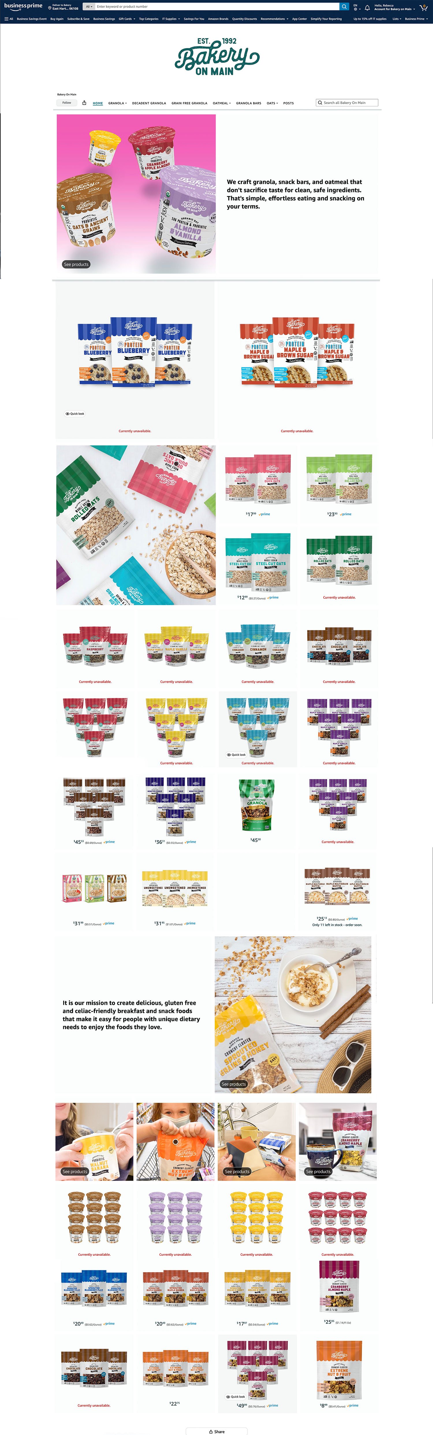
Old Bakery on Main Amazon Homepage
Rethinking the Visuals
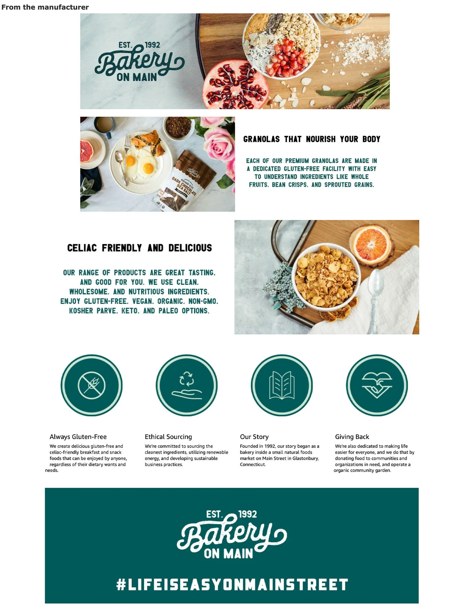
When reviewing Bakery On Main’s (soon-to-be Uncle Crumbles') item listing images and A+ content, one thing stood out: the visuals weren’t doing their job. The images lacked relevance, failing to show how the products could fit into the lives of the customers we wanted to reach. Instead of drawing people in, the visuals felt outdated and disconnected, offering no real value to potential buyers.
The A+ content, a key opportunity to educate and engage customers, was underwhelming. It was cluttered with uninspired text and images that didn’t align with the ideal customer persona we had identified. Rather than telling a story or solving a problem for the customer, it left them guessing about why Uncle Crumbles was the best choice for them.
So, what did we do?
✦
So, what did we do? ✦
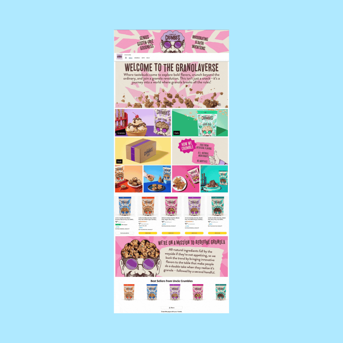
Uncle Crumbles Amazon Store
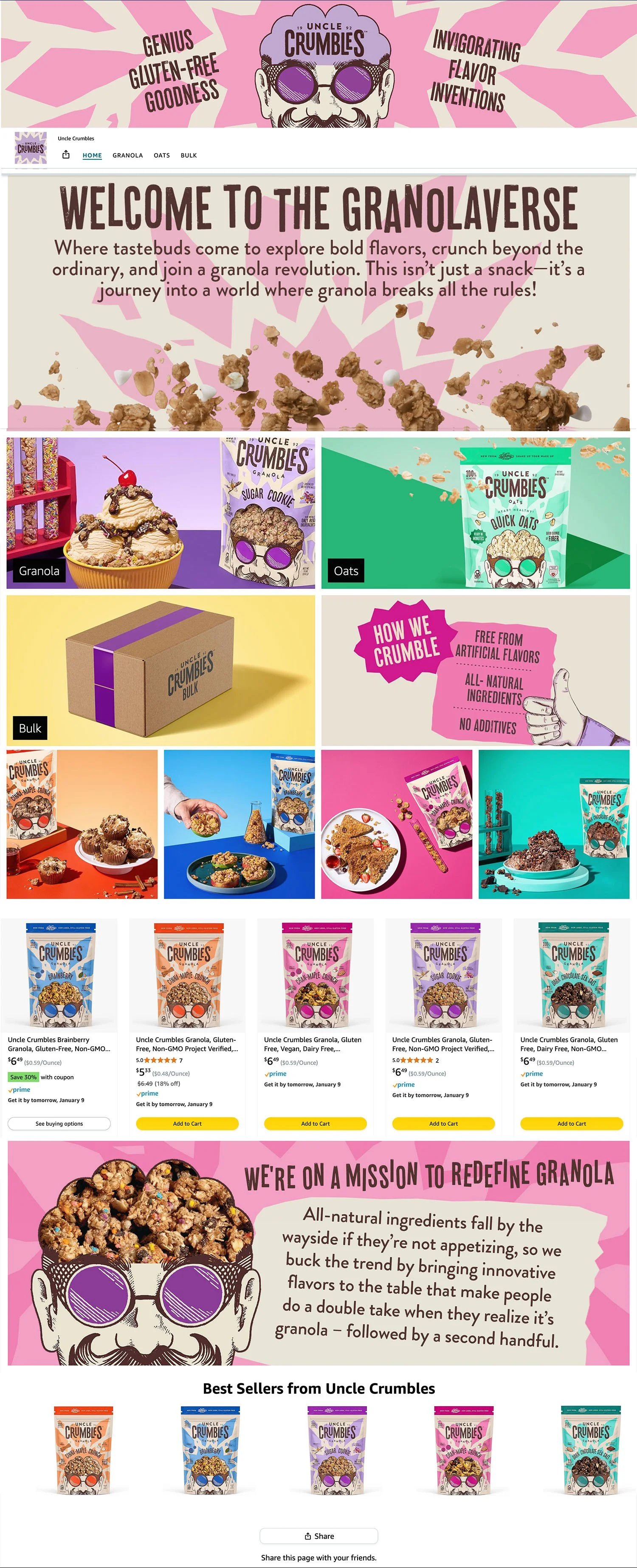
By transforming the storefront from a cluttered catalog into a thoughtful, user-centered experience, Uncle Crumbles gained a platform that not only showcased their products but also built lasting connections with their customers.
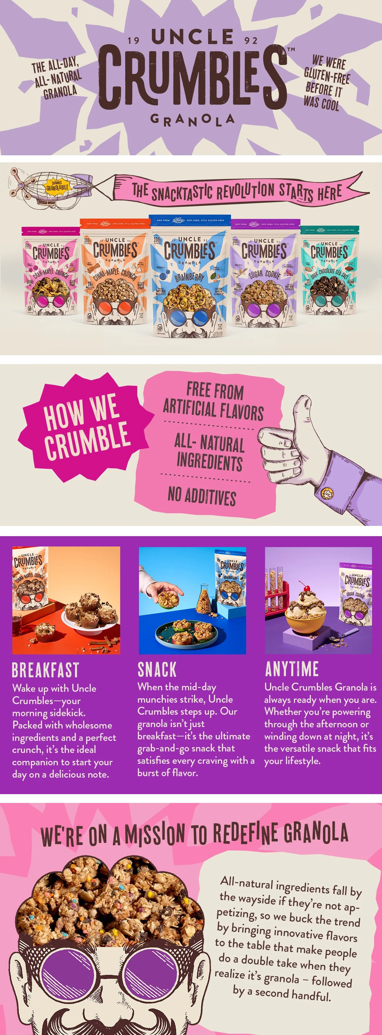
Uncle Crumbles Item A+ Content
The Transformation:
Redesigned Opening Section: I replaced the dense text with vibrant, on-brand imagery that immediately communicated Uncle Crumbles' values—wholesome ingredients, fun snacking, and an approachable personality. The section became a welcoming introduction, designed to resonate with the health-conscious yet playful customer.
Story-Driven Content: Instead of overwhelming shoppers with product listings, I created a curated journey. Customers first learned about the brand's heritage and commitment to quality before being invited to explore the product range.
Visual Hierarchy: Clear, bold sections were introduced to guide the customer naturally through the storefront, ensuring the experience felt easy and enjoyable.
Engagement with the Ideal Client: Content now spoke directly to the needs and desires of the target audience, answering their questions and addressing their pain points in a visually engaging way.
After having the listings and store front live for a few months, I will go back in and review the data from that to see if the shoppers resonate with this design.
Some data trends that we will look at are:
Click-thorough Rates
Customer Reviews
Unit Session Percentage
Best Seller Rank
Future Improvements
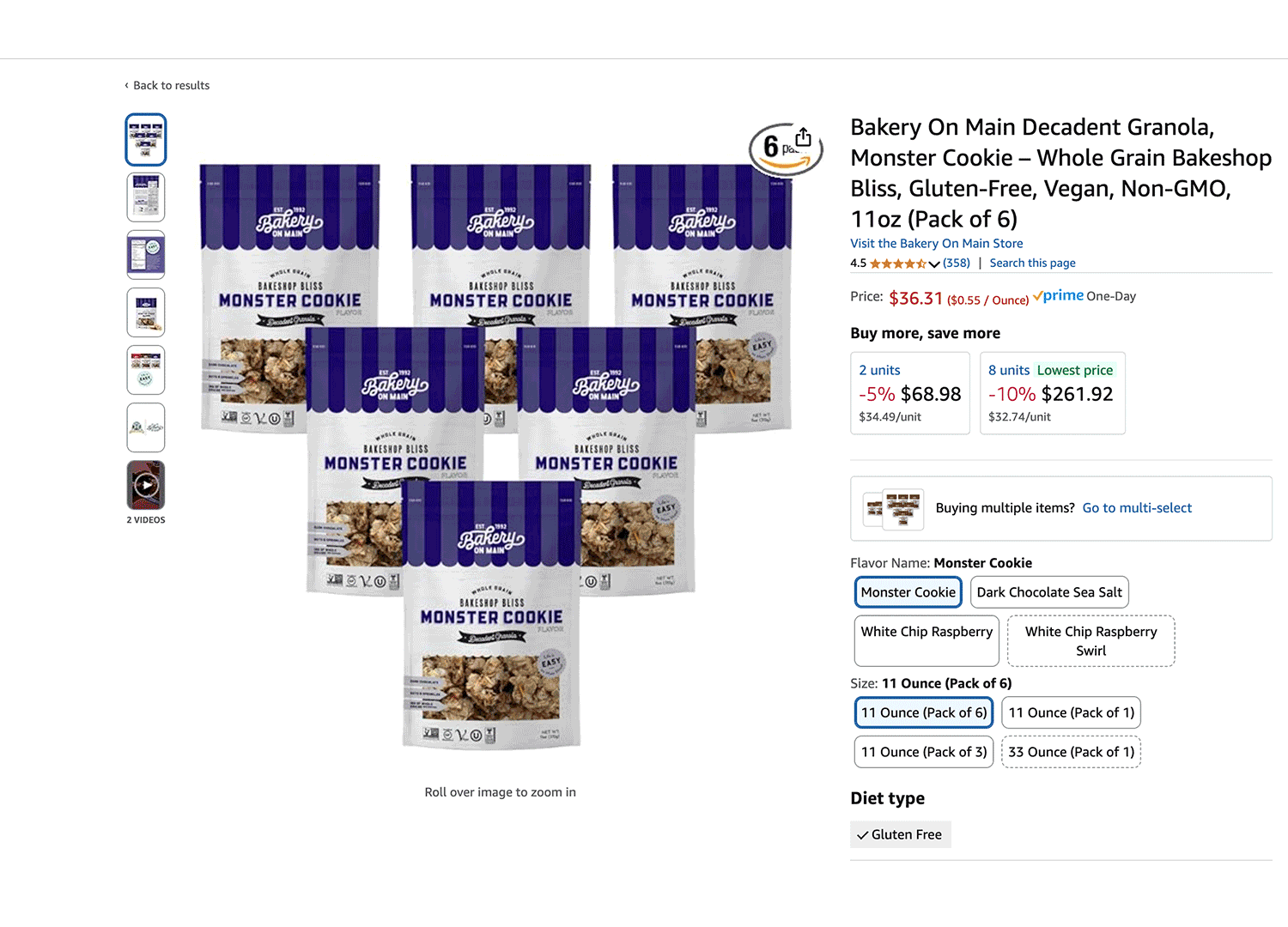
Uncle Crumbles Item Listing